
Stena Responsive Design & Usability Testing
Designed tablet and mobile UI for the Learning Hub of Customer portal of Stena Recycling, a B2B e-learning platform, then independently planned and conducted usability testing with 6 participants — achieving a SUS score of 92.05 and identifying 5 usability issues that directly shaped the product roadmap.

Project Overview
Stena Recycling's Learning Hub is an e-learning platform for enterprise clients, allowing companies to purchase, distribute, and track sustainability compliance courses for their employees. I was responsible for the UI design and tablet/mobile adaptation of all MVP pages, and independently led usability testing before and after product launch.
Responsibility: Moderated usability testing, SUS, Think-aloud
Keywords: UX/UI Design · Usability Testing · B2B SaaS · Sustainability
Timeline: Jan–Mar 2026
Introduction
Stena Recycling’s Learning Hub is an e-learning platform for corporate clients that helps companies purchase, assign, and track sustainability compliance training (such as ADR certification for the transport of dangerous goods). The desktop UI was led by a senior designer, and my responsibilities included: ① Independently responsible for the Tablet/Mobile UI design of all pages in Learning Hub, and worked closely with the developer to conduct implementation reviews. ② Independently planning and conducting usability tests before and after the product launch.
my responsibility
Complete responsive design for all MVP 54 pages for tablet and mobile devices
-
Catalog/Overview Page
-
Course Detail Pages
-
Checkout Flow (Multi-step checkout: Select license → Select location → Cost center → Confirmation)
-
Admin Page (Administrator manages purchased courses and assigns licenses)
-
Future addition: UI handling for Expiration Date

Independently plan and conduct usability testing before and after the product launch
-
Independently design a test plan (identify the problem, develop 6 task scenarios, create a SUS questionnaire, and establish a quantitative scoring framework)
-
Recruit 6 internal participants (with no prior knowledge) → Conduct moderated usability testing sessions of approximately 30 minutes each
-
Analyze the data → Write a test report
Responsive Design
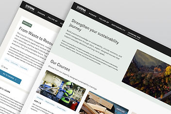
Stena Recycling's Customer Portal serves enterprise clients. sustainability managers, quality directors, and operations leads, who access the platform across a range of devices and contexts. While the Learning Hub was initially built desktop-first to support the purchasing and admin workflows that drive revenue, real usage patterns showed that learners often engage with course content on tablets during site visits, and on mobile when checking training progress on the go. A responsive experience wasn't just a technical requirement, it was a business one.
The Challenge: ‘’How can a desktop-first product enable enterprise customers to seamlessly complete the course purchase process across various devices without disrupting their existing design systems?‘’

Page Overview

Core Design Decision 1: Change the Mobile button from horizontal to full-width vertical stacking
The Checkout flow on Desktop uses horizontal Back/Next buttons, which would take up more than half the screen width and have insufficient touch area if directly ported to Mobile. Following system design guidelines, I changed the Mobile button to a full-width vertically stacked design, ensuring sufficient touch target while maintaining consistency with other pages in the portal.


Core Design Decision 2: Remove the border radius of the mobile content area.
The container copied from the desktop had a border radius, which created a "floating card" visual effect on mobile, conflicting with the mobile full-width content layout principle. After discussion and confirmation with the development and system designers, it was determined that the mobile content area should be full-width, and the border radius should be removed.
Core Design Decision 3: Typography and Spacing Guidelines.
When creating responsive versions of all pages, I helped determine the spacing guidelines: 32px spacing for Desktop/Tablet and 24px spacing for Mobile. This guideline subsequently became the reference for the entire checkout flow series.

Quantifiable Results
-
Completed UI adaptation for 54 UI pages, 5 page types (catalog, detail, checkout flow 3 steps, admin page)
-
Daily synchronization with the developer. The project Learning Hub completed the entire design → implementation → QA process in approximately 2 months.
-
Product successfully launched on schedule at the end of March 2026, and immediately processed 121 manual orders for ADR 1.3 courses after launch.
-
The page header inconsistency issue discovered during my design review spurred the initiation of the design system specification document.
-
The ''Mobile spacing specification (24px)'' that we helped determine became the benchmark for the entire portal's checkout series.
What I Learned
"Designing for mobile isn't about shrinking the desktop. It's about questioning every assumption — what does a user actually need on this screen, with this thumb, at this moment?"
Usability Testing
Before launch, I led usability testing for the Learning Hub platform to evaluate how effectively users could discover, understand, and purchase learning content. The study focused on the end-to-end experience, assessing navigation clarity, ease of learning, task completion efficiency, and overall satisfaction.
The findings revealed key friction points in the information architecture and purchasing flow, providing actionable insights that informed design refinements and improved the platform’s overall usability.
Example research questions:
-
Do users understand how to browse and find courses?
-
Can users easily view course details and pricing?
-
Can users complete the purchase flow without assistance?
-
Do users understand how to assign courses to organisational members?
-
Do users understand how to start an assigned course from receiving the email?
-
Do users understand the license mechanism has limitations? Meaning that once allocated, it cannot be undone.
-
Which parts of the interface are confusing or unclear?


The study consisted of six moderated usability testing sessions with internal participants who had no prior experience with the platform. Each 30-minute session employed a think-aloud protocol to capture users’ decision-making processes, expectations, and pain points while completing key tasks.
To evaluate the overall experience, I collected both quantitative and qualitative data, including task success rates, completion time, performance ratings, satisfaction scores, SUS results, and observational insights. This mixed-method approach provided a comprehensive understanding of usability issues and opportunities for improvement.


Key metrics summary

Key Findings
🔴 Critical — Course duplication created unnecessary cognitive load
Users were confused by seeing the same course displayed multiple times and expected a more consolidated, aggregated view of their learning content.
🔴 Critical — Learning progress tracking was difficult to discover (Move to Iterative validation)
Most participants failed to locate their learning progress because the entry point was labeled “Manage Licenses,” which did not match their mental model or expectations.
🔴 High — License purchasing logic lacked transparency
Users struggled to understand how licenses could be combined, particularly the relationship between individual purchases and bundled packages.
🟡 Medium — Learning Hub entry point lacked visibility
Several participants overlooked the Learning Hub navigation entry, indicating that its placement and visual prominence were insufficient.
🟡 Medium — Irreversible actions lacked adequate safeguards
Warning messages for destructive actions did not provide enough emphasis or clarity, leaving users uncertain about the consequences of their decisions.
Iterative Validation
One of the most impactful findings emerged during the first three usability sessions, where participants consistently failed to locate learning progress due to the “Manage Licenses” label. Based on this insight, I introduced a revised labeling and navigation solution(Keep the detail view opened when user access from a specific course) during the testing cycle. The subsequent three sessions demonstrated a significant improvement in task completion and discoverability, creating a rapid design-validation loop that allowed the team to identify, address, and verify a critical usability issue within a single round of testing.

Before
‘’Manage licenses’’ tab in the navigation bar is unintuitive and conflicts with user mental models. Users were unsure the Progress tracking locates under the ‘’Manage licenses’’ button.

After
Then we changed the ''Manage licenses'' tab into ''Manage courses'', and we keep the detail view open when user access from a specific course. Which is very helpful in the later 3 testings, significantly increasing the success rate.
Quantifiable Results
-
SUS score of 92.05, reaching the "Best imaginable" level, significantly higher than the industry average.
-
The product successfully launched as scheduled at the end of March 2026.
-
Specific improvement suggestions were developed for 5 usability issues and added to the product backlog.
-
Throughout the project, as an intern, I independently completed the entire process of test design, execution, analysis, and reporting.